Author Archives: Kathy

PPR Season 12 – Challenge 6

Posted on

The challenge this week is called “Let’s Go Glamping.” This week we were to create an editorial look inspired by nature – not something to be worn for camping!

Let me get it out of the way first – I was not inspired by this challenge at all. After so many weeks of very limited parameters, this challenge seemed incredibly open-ended. And I find that having specific limitations really helps spur my creativity. So I just wasn’t feeling the challenge this week.

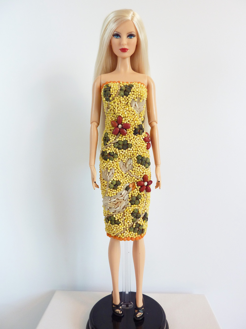
I moped around feeling uninspired for days, the deadline closing in on me. I had to do something! So I went with one idea that I thought I could maybe pull off in the last few hours of the challenge (yes, I really, really procrastinated this week.) I was inspired by allium flowers, those are in nature, right? I really had wanted to do a dandelion dress, but my fabric choices didn’t include the vibrant yellow I needed for that. So allium it was.

allium


Allium by Steve A Johnson on Flickr.

Main


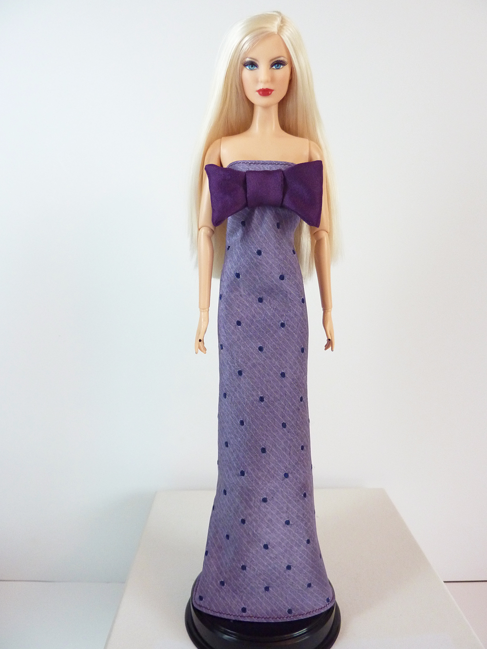
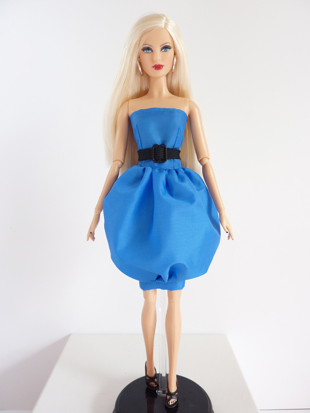
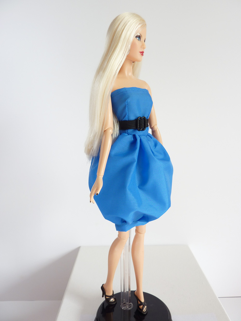
Zhanna heads down the runway in a purple mini-dress featuring a lavender layered overskirt.

I fully admit that this garment is not good this week. It was one of those situations where I was coming in just under the wire and simultaneously things weren’t coming out the way I wanted. Frustration set in and at some point, I just said “Fine. Good enough.” So I can’t really defend this look on the runway. It’s too simple, it has taste issues (it ended up a lot shorter than I intended) and the overskirt/peplum looks like she shoved a tutu on over her dress.

Look


For styling the look from the Belk Wall I added the Lauren Ralph Lauren Saffiano Belt which I think would drastically help improve the look. I also added Erica Lyons Silver Bangle Bracelets and G by GUESS Tarrah Booties. I went a little bit edgier with the accessories to help pull the look out of being so “ballerina-y.”

For hair, I think something short and edgy would be cool, like Robyn’s bleach blonde cut. Apparently wigs can be used on the show? So maybe I could find a nice wig for my model that looks like that. For makeup, I think going really dark around the eyes would add to the edgy look.

As I’ve stressed above, I really don’t feel very positively about this look. It didn’t turn out the way I wanted and I don’t think it represents me as a designer at all. That being said, I can see this being worn on the red carpet or a photo call, if not for an editorial. I could see some young starlet (probably from the CW or something) wearing this to the Grammys or VMAs or a “Young Hollywood” awards. Something that tends to be more goofy in its fashions. Still, I don’t think the judges would be impressed this week. I’d probably be in the bottom three, for the reasons I listed above. Oh well, at least PPR is just for fun and I can be back for another round next week!

PPR Flickr page – look at it! Ooh and aah over fabulous tiny fashions!

PPR Season 12 – Challenge 5

Posted on

Well, let’s jump right into it. The challenge this week was called “YOU Chose Your Materials.” It was yet another entry in the frequently utilized “unconventional materials” column this season. I think this is arguably the third such challenge in five episodes. Jeez. Anyway, the challenge was to create a lux, high-end look utilizing materials from three locations: a wallpaper store, a gourmet food store, or a home good store.

We were supposed to utilize two of these three options, but I utilized only one and called it a day. I didn’t feel like running all over town to both the grocery and a (affordable) home good store. And I don’t have any idea where one would even find a wallpaper store these days! So I decided to use two different materials from one type of store instead; I chose the gourmet food store.

Once I had narrowed it down to my store of choice, I began thinking about possible items I could utilize that wouldn’t look weird at the scale of my model. My initial idea was to use pasta in some way to create a look, but it just wasn’t calling to me. For some reason I had the idea of the bulk bins in my head, maybe because there are a variety of color and textures there and I could pick up quite a lot for not too much money. I can’t always track my thought process very well, but I became fixated on the idea of mosaics for this challenge – I have no idea where it came from, it was just there. I had this vision of a mosaic-style bird made out of rice, the grains of rice looking like feathers. Whatever, brain; let’s go with it. So at the local health food store I picked up a variety of grains, beans, and seeds for my mosaic-inspired look.

Supplies

All of this for a grand total of $2.61 – including the paper bag became…

Main

This! (Zhanna heads down the runway in a strapless, knee-length dress encrusted in grains, beans, and seeds.)

I determined that to really engage with the challenge, the base for my dress would also need to be an unconventional material. Using fabric and then applying the foods would be cheating. So I created the base for the dress out of the paper bag using a technique I learned in elementary school to make it softer and more malleable (crumpling it up and smoothing it out repeatedly.) I then sketched out my general design and began the tedious task of placing my designs. It’s supposed to be a bird (lower left hand side) and vines, leaves, and flowers.

As I had planned, the bird is made out of grains of white and brown rice, as are the white flowers and the stems/vines. The red flowers are adzuki beans with Middle Eastern couscous centers. The leaves are French lentils, the orange accents at the hem and top are red lentils. The overall “background” texture is millet. It’s all held in place by lots of glue.

Creating this look was quite time-consuming, but also in some ways relaxing. For the design elements, every grain or lentil was hand-placed with tweezers (the millet background notwithstanding.) The millet still took some time, but was not a grain-by-grain process. I painted on my glue and then sprinkled the millet over it, pressing it down and shaking off the excess. Needless to say there are a variety of small foodstuffs that I’m sure I will be discovering over the next few weeks throughout my craft room.

In styling this look, I didn’t want to take away from the bright natural colors of this look, while still being luxurious and “red-carpet ready.”

Style

From the Belk wall I chose the ABS by Allen Schwartz Gold Tone Coil Bracelet because I thought the beading reflected the texture of the dress quite nicely. I also added a pair of Steven Ravesh Pumps in Olive Nubuck which matched the green French lentil “leaves” quite nicely. I also highlighted a close-up of the bird portion of the dress.

In terms of hair and makeup, I think the hair would be lovely loose, in softly curled waves. The makeup should use slightly more neutral autumnal tones than I usually utilize to create cohesion. Maybe coppery eye shadow and a medium-dark lipstick, deep in color but with a more orange-y undertone would work.

In general, I’m very happy with how this look turned out. It’s not exactly as I envisioned it, but it’s pretty darn close. I’m thrilled that the materials actually stuck to the dress base, I was envisioning seeds and lentils rolling down the runway, but it’s held up very well so far (Thanks, Tacky Glue!) I think it’s okay that I only used materials from one shop, as I could have gotten the paper bag or a similar material from the other stores, I was just being time- and cost-conscious in only utilizing one shop. I think I might be at the top this episode, but I’m not sure – it’s hard to tell with these judges. I mean, the bottom three were criticized for using placemats; the top three were lauded for using placemats. Would I be congratulated for using the unconventional materials in the way I did, or would I be criticized for using them as an application on the garment? Who knows. Well, I’m happy with it, so there.

And as always, check out the PPR Flickr Page for more great designs.

PPR Season 12 – Challenge 4

Posted on

This week’s challenge is titled “Tie the Knot.” We were to create a look using a bow tie as our inspiration. The bow tie should be used in an unconventional way. As we weren’t provided a variety of ties, we could also use a regular necktie. We could also use additional fabrics if desired.

I don’t think Joe would have been pleased had I used one of his ties, so off to the thrift store I went. They didn’t have any bow ties, so I picked out a regular neck tie instead. Unsurprisingly, the pickin’s were pretty slim at the thrift store. Lots of extremely ugly ties. Sorry, but I don’t think a Santa Claus tie is particularly fashionable. I ended up finding one that I didn’t despise, but it was very stained and dirty.  It was time to make it work. So I washed the tie. It was quite disgusting. The tie bled like crazy, so I’m glad I was hand washing it alone in the sink. I pulled it apart, removed the sodden inside material, and let it dry (and I completely neglected to take a photo of it.) A coolish ironing and some spray starch later, I had my main material.

My idea was to play with the idea of formal wear and the shape of a bow tie. I wanted to make a formal dress with a bow tie as the main feature.

Main


Zhanna walks the runway in a simple gown featuring an oversized bow tie at the bust.

The basic silhouette of the dress is made with the necktie. I thought the lavender and navy polka dots were a nice scale for my model. The shape of the dress is very simple. But it had to be, due to the giant boob bow that was the focal point of the look. I made the bow tie out of a bit of aubergine satin.

I had the worst time trying to work with the tie material. I typically create darts and other shaping to fit my garments to my model. This material fought me like crazy. I believe the fabric is cut on the bias, so it stretched in odd ways and seemed to fight me constantly. I’m just not versed in working with slippery bias cut material. So I kind of gave up on trying to get a tailored fit and just left the dress “figure skimming.”

In styling this look, I was thinking along the lines of “charity gala.” So not really red carpet, but more “rich ladies at a $5,000 a plate dinner.” So the styling is definitely a bit more…extravagant than normal?

Look


In going a bit more over-the-top than normal, the Belk wall was pretty useful this week. I picked the Badgely Mischka Humbie II Sandal (what is with that name?) the Carolee A Pearl Affair Cluster Gold Bracelet, and the piece de la resistance, the Mary Frances Love n Der Handbag. (Was this the bag that Sandro wanted to use? I thought it worked well with my dress.)

For hair, I think smooth and loose like Zhanna’s hair is nice, though a low chignon would also be lovely. Makeup should be dramatic for night, a deep, smoky eye and medium-tone lipstick.

Overall, I’m not all that happy with this look. I think the silhouette of the gown is too simple and the boob bow is a weird size. It is definitely not one of my best looks. I think I would be in the bottom three this week. Luckily for me, Sandro removed himself via his shitfit, so I am safe.

As per usual, don’t forget to take a look to see what the other participants created this week at the PPR Flickr Page.

PPR Season 12: Challenge 3

Posted on

This week’s challenge is called “An Unconventional Coney Island.” We were to design an outfit using items that can be won at a carnival. Furthermore, our outfits should be inspired by three words that can describe frozen yogurt (ugh.)

Well, let’s set aside the word association part of the challenge for a moment; there was no way I was going to go to a carnival and actually play rigged carnival games in a desperate bid to get materials. So I decided to go to basically the same source as carnival prizes: the dollar store. The dollar store actually ended up being a pretty great place to find carnival-like materials–they still had a lot of summer stock. I didn’t go in with a particular idea in mind, so I went a little bit crazy choosing materials. Hey, it’s all just a dollar, so it’s not like I was breaking the bank!

Items

I picked up: two packages of water balloons, two beach balls, a spiky play ball, and a plush dolphin. I was most inspired by the balloons, and pink was the best color option, so I decided to stick to a monochromatic pink palette.

I was really inspired by the water balloons. They are a lot smaller than regular balloons and seemed to be a great scale for my model. I envisioned a petal skirt made of rows of the balloons. I just wasn’t sure what to pair the skirt with, so I bought enough stuff to have options.

Oh, and back to the frozen yogurt “inspiration words” I decided my words would be “summery,” “refreshing,” and “fun” (I know most people wouldn’t describe frozen yogurt as “fun” but did you see some of the descriptors people used on the show? “Happy?” “Divine?” “Luxurious?” Yeah.)

Main

Zhanna heads down the runway in a bright pink petal skirt and a matching pink crop top.

The crop top and skirt base are made of the pink section of the beach ball. The skirt treatment is the water balloons. These materials were quite difficult to work with. The beach ball material has a tendency to stretch and deform as it’s worked with and the water balloons were absolutely coated in some sort of powder which made it difficult to affix them to anything. But hey, that’s what an unconventional materials challenge is all about, right?

I knew that the skirt would be rather eye-catching, so I wanted the outfit to be otherwise quite simple. I’ve done a dress with a similar skirt treatment before (last season’s unconventional material challenge – candy.) So I wanted to mix up the silhouette just a little bit, so I decided to do a skirt and crop top. Very few people could effectively pull off this look, but I do think that even though the top is strapless as well as cropped, it doesn’t quite cross the line to vulgarity due to the high waist of the skirt.

In the styling, I wanted to speak to the “summery” part of my descriptor words.

Style

Once again, choosing from the Belk Wall was a bit difficult. Sorry to be so negative, but I really am not impressed with the accessory wall this season. For shoes, I chose a neutral platform sandal, the Dolce Vita Paylan Wedge Sandal. I also added a pair of Ralph by Ralph Lauren Plastic Cat Eye Sunglasses and a Vince Camuto By the Horns Silver Pendant Necklace.

I think the styling of this look indicates the wearer would be a fashion loving girl who isn’t afraid to be daring. I see this look as being extreme street wear – not really a red carpet look.

In terms of hair, I think something edgy would be cool. I’m thinking an undercut style, though I don’t know how amenable a model would be to such a drastic look. For makeup, I imagine going with a super neutral, pale lips and a bold extra-smoky eyeshadow.

In general, I like this look. It might not be something I would ever wear in a million years, but I think it is interesting. I like how the petal skirt looks, and I’m proud of myself for moving a little out of my comfort zone. I think I would be in the middle this week because the petals don’t lay perfectly and there are some minor fit issues with the top.

As always, don’t forget to check out the PPR Flickr page for other fantastic designs!

PPR Season 12 – Challenge 2

Posted on

The challenge this week for Project Project Runway is called “Million Dollar Runway.” We were to choose diamond jewelry from anywhere on the internet and design a look to go with those jewels. Goodness, was that ever tough! There are so many gorgeous jewels online, I didn’t really know where to start! Recommended sites included Tiffany & Co., Blue Nile, and Van Cleef & Arpels. Let’s just say there was much admiration going on. Still, I wasn’t finding what I was looking for, so I started looking elsewhere. My searches took me to Sotheby’s and Christie’s as I love vintage jewelry, and they get the best of the best. Let’s just say, oh, half a day was dedicated to drooling over amazing jewels. I eventually landed at Fred Leighton and just knew I had found just “the thing.”

jewels


It’s a circa 1920’s Art Deco diamond necklace. So beautiful.

Once I found “the necklace” I almost immediately had my inspiration – the Zigzag Modern sub-type of Art Deco aesthetics. (Could I be more pretentious?)

I knew I wanted to design a gown, although gowns definitely are not my strong point; I see myself as more of a sportswear designer. But with what else would one wear such an extravagant necklace?  With the gown being a given, I wanted it to feel statuesque, like Art Deco skyscrapers that would show off the jewels rather than overpower them. My inclination was towards a black dress, but that seemed too simple. So I settled on a black and white scheme. I also wanted it to have strong visual, graphic interest. As the Rose Iron Works website describes it, Zigzag Modern, “features repetitive, geometric designs, both figurative and abstract, with zigzags and angular patterns.” So I definitely wanted to include some aspects of that. I’m crazy, but I had a vision of equilateral triangles.

Main


Zhanna walks the runway in a black column dress featuring a black and white triangle treatment at the waist.

Yes, triangles it was. And what a challenge (but in a good way.) The fabric I chose was a thin but crisp taffeta (“party taffeta”?) The triangles are .5″ from apex to base. I used a template for the triangles, drawing them on the fabric with marking pencils. I then Fray-Checked around the triangles and then cut around them with an eyeballed seam allowance. Next, I sat in front of DVRed episodes of Inspector Lewis for a few hours and sewed the triangles together by hand (and I am not a hand sewist!) I then made the upper bodice piece and skirt, and then hand stitched those on as well to ensure decent triangle points. The skirt and upper bodice are very simple to allow the waist treatment and the jewels to do the heavy lifting.

In styling, I wanted to keep things super simple. With an eye-catching diamond necklace and a graphic dress, I didn’t think it needed much else.

Challenge 2 Style


So from the Belk Accessory Wall I added the black Vince Camuto Zella Pumps and the ABS by Allen Schwartz Large Stone Set Pave Ring. I’m not sure about the ring, but I thought it might be a fun “high-low” juxtaposition with the real diamond necklace.

In terms of hair and makeup, I think vintage style would be great for the makeup. I’m thinking a touch of smoky gray eyeshadow, black lashes and dark plum red lipstick in a “Cupid’s Bow” style would hearken to the era of Art Deco without being super literal. For hair, I think a slicked back ponytail would be lovely.

over shoulder

Overall, I am ridiculously proud of this look as it is almost exactly what I had imagined. I was really, really unsure if I could pull off the triangles. I seriously spent two or three days thinking about how I could do it before I even bought my fabric. That’s one luxury the real Project Runway contestants don’t have, that’s for sure. I think this is one of the coolest looks I’ve ever made for Project Project Runway. It’s just so satisfying to see the seed of an idea come to fruition. It’s certainly not perfect (my hand stitching skills need some serious work and the seams ended up bulkier than I had hoped) but it is certainly one of the most ambitious looks I’ve attempted. This week I’d like to think I’d be near the top. Maybe not the challenge winner, but perhaps beginning to be noticed by the judges.

Don’t forget to check out the other designers’ looks at the Project Project Runway Flickr page. See you on the Runway!

PPR Season 12 – Challenge 1

Posted on

After I dropped out of Project Project Runway Season 10, I wasn’t sure I would ever do PPR again. I just felt so bad abandoning the project last year, never resuming it after the move was completed. I felt like I had given up and couldn’t do it again. So imagine my surprise when I saw the announcement for PPR Season 12 and instead of dread I felt – excitement?! With PPR not following Season 11, it’s been a full calendar year since the beginning of the last PPR season, so I’ve had time to “recharge my batteries” as it were.

The tl:dr version: I’m back for more PPR.

This week’s challenge is called “Sky’s the Limit.” We were to create a look that represents our points of view as designers using parachute fabric (or the closest stand-in we could find.) We had 19 hours to complete the look (which I will say now, I didn’t use anywhere close to the allotted time.) As far as I know, we didn’t have a budget for this challenge, as the designers were provided with their materials. (Speaking of budgets, I think the season’s giving the designers a lump sum budget to use as they desire is brilliant. Is PPR going to follow this style of budgeting as well?)

As we were not provided materials (what do you mean a parachutist didn’t drop in so that I could accurately recreate the show’s challenge?!) I knew I needed to find a reasonable facsimile of parachute fabric. The closest thing I could think of was rip stop nylon, so I began designing my garment with that fabric’s feel in mind. I wanted to design something that would utilize the fabric’s intrinsic body and drape (or lack thereof.) So I started thinking about how I could use the stiff “plastic-ness” of the fabric to create interesting shapes. I then had a connection in my head: parachutes are in the sky, balloons are in the sky. A balloon dress. For me, the most iconic balloon dress (partially because it was the first time I saw such a thing) is the original 1959 Barbie outfit Gay Parisienne. And how perfect since a Barbie doll is my PPR “model”? So I decided to make an modern homage to that dress.

Full 2

Zhanna heads down the runway in a bright blue balloon dress.

This dress had a couple of iterations before this one. I struggled in getting the proportions right and the skirt to sit just the way I wanted. My initial design had a way more complicated bodice, for which I spent a lot of time drafting the pattern. Once I had the pattern drafted, though, I knew it was way beyond my abilities to actually create. So that was scrapped. My second iteration had to go into the trash because it was too short-waisted and the proportion was all wrong. And furthermore I discovered that pins created unsightly holes in the fabric, so aside from anything that would be hidden inside the dress, I couldn’t use them. So this is the third iteration of this dress. It features a simple, slightly dropped-waist bodice with a full gathered balloon skirt. The skirt terminates just above the knee, and would be very difficult to maneuver in if it were for a real person and not a static mannequin. The look is completed with a woven “parachute ripcord” belt with a buckle. (Fun fact, the buckle is a bra strap adjuster. They are the perfect size for faux buckles. Just FIY.)

In styling the look, I wanted fairly neutral items so the exaggerated skirt wouldn’t be competing for attention. The balloon skirt is clownish enough, over-the-top accessories would make the look a disaster!

Style

From the Belk wall I chose, from top right, the “Hobo Deanna Clutch” in black. I like the simple lines of this clutch. I then picked the “Vince Camuto Summer Metals Silver Multi Strand Necklace” because the strands felt similar to the woven straps of a parachute. Finally, I chose the “Jessica Simpson Waleo Pump” in black leather. Who says blue and black can’t look nice together? I’m not sure how much of this season I will use the Belk wall, as I don’t think most of the items fit my style very well. Or I will just end up reusing the same items over and over. Oh well.

In terms of hair, I think a sleek, slightly bouffant ponytail would accent the look nicely. For makeup, a bluish-gray smoky eye with a defined black lash line would be pretty and would highlight the way the dress compliments Zhanna’s eyes. Fresh pinky cheeks and medium pink lips would help complete the look.

Full Side

Overall, I think the look is okay. There are a lot of construction errors on the dress that are driving me crazy, but I just have to deal. I think the dress does speak to its vintage inspiration while updating it to modern times. I’m happy that the rip stop nylon did hold its shape the way I wanted. It was pretty hard to work with, so I’m glad that at least that aspect of my idea came to fruition. Does it represent me as a designer? I think it does in the way I like to play with shapes and my love of color. I think I would be safe this week. Not at the top, for sure, but I think I may have managed to stay out of the bottom (at least this dress keeps her lady parts covered, unlike some of the real contestants’ garments.)

And remember, the other designers’ looks can be seen on the PPR Flickr page. Check it out, there are always wonderfully talented people there!

Guess Who’s Back?

Posted on

Well, it should be obvious – I’m back. Yes, after one year (give or take a couple of weeks) of hiatus, this blog is back in business for Project Project Runway Season 12! This summer I don’t have moving as an excuse, so let’s see if I can make it all the way to the finale this year. Do I still remember how to make tiny fashions? Has my creativity floundered? Can I still “make it work”? I guess we’ll just have to see!

PPR Season 10 – Challenge 2

Posted on

Oh goodness. This week absolutely kicked my butt. Probably my worst unconventional materials challenge thus far, if not my worst challenge ever. The challenge this week was called “Candy Couture.” We had a budget of $25 and one day to create a look made out of candy. Thankfully, we were allowed to use fabric as a base.


Zhanna heads down the runway in a red strapless party dress featuring a fringed and layered skirt and a strapless, shiny top.


As you can probably see, I struggled with this challenge quite a bit.  I was just so befuddled. Scale was a real problem. Everything in the candy aisle seemed so enormous compared to my model. I had originally planned to make a dress with miniature M&Ms, kind of a cool mosaic-inspired look. But apparently mini M&Ms have been discontinued. I swore they still moonlighted in the baking aisle, but no dice. Since I couldn’t think of any good replacement for the mini M&Ms for the mosaic look, I decided I liked the idea of doing a fringe-y layered skirt. I decided that Twizzlers Pull and Peels would work okay for this purpose. But then I was at a complete loss when it came to the top. I went to two different stores and nothing in the candy aisle was all that inspiring to me. I ended up purchasing a box of Fruit Roll Ups. That’s pretty much candy, right?

Then came the nightmare of actually trying to create the look. Ugh. Not fun. The Fruit Roll Ups were so much stickier than I remember them being. They stuck to themselves and were impossible to remove from the thin plastic. It was just a mess. I was eventually able to cut out a template with kitchen shears and hot glue it down. And the Twizzlers weren’t much better. They were also a sticky mess, sticking to my fingers, each other, my work surface. It was beyond frustrating. I seriously felt like I was going to cry. Eventually I got everything glued down and then basically ran to get pictures taken because I seriously have no idea how long this will last. So my pictures are terrible this week, too. Terrible pictures to go along with a terrible look. There was just no way to achieve a good, tailored fit with the materials I chose.


To style this look, I wanted to make it feel a bit edgy, yet still red carpet ready. From the Lord and Taylor website I accessorized with:

BCBG Max Azria Snake-Print Ring

Franco Sarto Vanna Platform Sandals

BCBG Max Azria Tribal Beaded Necklace

Am I happy with my look this week? No, not really. It was frustrating to me at every point along the way. I didn’t enjoy my materials, I felt incompetent using them, and I feel like the end result reflects that. I think I would be in the bottom three this week. I hope I can squeak by. I’m just glad this challenge is behind me.

PPR Season 10 – Challenge 1

Posted on

Getting back into the groove of Project Project Runway hasn’t been as difficult as I expected. I thought that I would just feel creatively out of juice. Last season was quite difficult and putting together six looks for the finale was quite the undertaking. I honestly have no idea how professional designers can sustain it year in and year out. So I was looking forward to feeling overwhelmed by another season. But I’m pleasantly surprised. Maybe it’s that this week’s challenge is fairly straightforward to help me ease back into things.

This week’s challenge is called “Times Square Anniversary Party.” (Hey where did all the fun, punny episode titles go?) The challenge, as I undertook it was to choose a prior PPR “portfolio look” that represents my aesthetic and create a companion piece to go along with it. (For new participants they were to create two companion looks. Nothing like a trial by fire the first week!)

For my “portfolio look” I chose the dress I made for the tenth challenge from last season.

I chose this dress because I like the way the dress fits, I think the color scheme is interesting (although it is based on a Nanette Lepore textile as per that challenge) and I think it speaks to my inclinations towards simple, graphic design.

In designing the companion look, I knew I wanted it to speak to those aspects: fit, color, and creating something graphic. I wanted to create something that would look like it came from the same collection, as that’s how I interpreted the challenge directive. I also knew that I didn’t really want to do another dress, as that seemed like it could be a bit repetitive. I considered making a gown in honor of having done so for the first challenge in the last two seasons, but I just didn’t feel up to it. But I did know one thing;  I wanted to make a pair of red skinny pants.


Zhanna heads down the runway in that pair of red skinny pants paired with a tank featuring asymmetrical stripes in red, lavender, and orange.

Whereas the original look was graphic, yet sweet, this look was intended to exude a bit of an edge. My main concern with this look was achieving a well-fitting skinny pant. It’s hard to sew pants at this scale, but unlike a real human body, dolls don’t need to move, so pants are nowhere near as difficult to make as in real life. After I had conceptualized the pants, I was at a bit of a loss as to what to pair them with. I wanted something that would incorporate the colors from the original piece, but I didn’t want to reuse the same technique as in the panel on the dress. So I decided to make a simple tank, in part to add to the almost-androgynous silhouette I was creating with the pants. I decided to do the strips of color asymmetrically to keep the eye moving and to avoid highlighting any particular area of the body. I had considered creating a stripe panel as on the dress across the bustline, but I determined that it would add too much bulk and stiffness to the top. I wanted something light, slightly drape-y and summery.

To style the look, I wanted to evoke that summery feel.


First of all, I did not use the items provided from the Lord and Taylor Accessory Wall. I found it way too difficult to navigate and the choices severely limited. Instead I simply chose items from the Lord and Taylor website.

In the bright summer sun, the look definitely needed some sunglasses. I chose Michael Kors Caicos Plastic Aviator Sunglasses in orange. I promise I’m not sucking up the the judge, they really were the best option for the look. For shoes, I chose some breezy sandals that look sophisticated but not too fussy: Pour La Victoire Faine Strappy Leather Sandals. I chose the sandals in a similar red to the pants to avoid a jarring transition between the pants and the shoes. Finally, I added a House of Harlow 1960 Etched Stacked Bangle Cuff to bring in a touch of metallic, for interest.

Overall, I think the look is solid. I think the pants are well-made and pretty much exactly as I had envisioned them. The top doesn’t excite me as much, but I think it’s passable. And I do think that the companion piece works well with portfolio piece. They do look like they could come from the same collection, which was part of my goal.


(Yes, I keep all of my previous designs.)

Don’t forget to check out the other designers on the Project Project Runway Flickr group. I can’t wait to see who is participating and what they’ve designed!

PPR Season 10 – New Model

Posted on

I’m kind of at a loss as to what to call this season of Project Project Runway! It could be called Season 10 to match the show, but it hasn’t been in existence from the show’s inception; it’s really on Season 4. But calling it Season 4 is confusing, too, since the show is on Season 10. Adding to the confusion, this will be my third season participating. Ahhh! But I guess I’ll keep it simple and call it Season 10, just for the sake of clarity, even though it isn’t technically correct.

I can’t help myself and have decided to pick a new model for Season 10. For me, there’s something about having a new model that really inspires and excites me. I totally see why real designers get so competitive about models or use them as muses. I can see how a model’s personality could have an effect on the designer’s output. My first year of participating, my model was Gia. Gia had strong features and a quite serious look about her. My second year of PPR, my model was May, who had a more sweet face that looked like she was always on the cusp of smiling. This year, I’ve picked Zhanna as my model.

Zhanna is definitely the edgiest model I’ve worked with. I was drawn to her nearly-white platinum blond hair and her piercing blue eyes. Her bright red lips were a bold choice for her pale skin and hair, but she looks great.

She’s also a bit of a change for me because she’s a bit more flexible than my previous two models.


I’m not sure how much this will effect the way I pose and shoot my garments, but it is something new and different for me and I enjoy a challenge.

I’ve been hard at work on my first challenge. I thought I’d be able to have a photoshoot today but the day is thus far too overcast to get good shots. See you on the runway!