Well, let’s jump right into it. The challenge this week was called “YOU Chose Your Materials.” It was yet another entry in the frequently utilized “unconventional materials” column this season. I think this is arguably the third such challenge in five episodes. Jeez. Anyway, the challenge was to create a lux, high-end look utilizing materials from three locations: a wallpaper store, a gourmet food store, or a home good store.
We were supposed to utilize two of these three options, but I utilized only one and called it a day. I didn’t feel like running all over town to both the grocery and a (affordable) home good store. And I don’t have any idea where one would even find a wallpaper store these days! So I decided to use two different materials from one type of store instead; I chose the gourmet food store.
Once I had narrowed it down to my store of choice, I began thinking about possible items I could utilize that wouldn’t look weird at the scale of my model. My initial idea was to use pasta in some way to create a look, but it just wasn’t calling to me. For some reason I had the idea of the bulk bins in my head, maybe because there are a variety of color and textures there and I could pick up quite a lot for not too much money. I can’t always track my thought process very well, but I became fixated on the idea of mosaics for this challenge – I have no idea where it came from, it was just there. I had this vision of a mosaic-style bird made out of rice, the grains of rice looking like feathers. Whatever, brain; let’s go with it. So at the local health food store I picked up a variety of grains, beans, and seeds for my mosaic-inspired look.
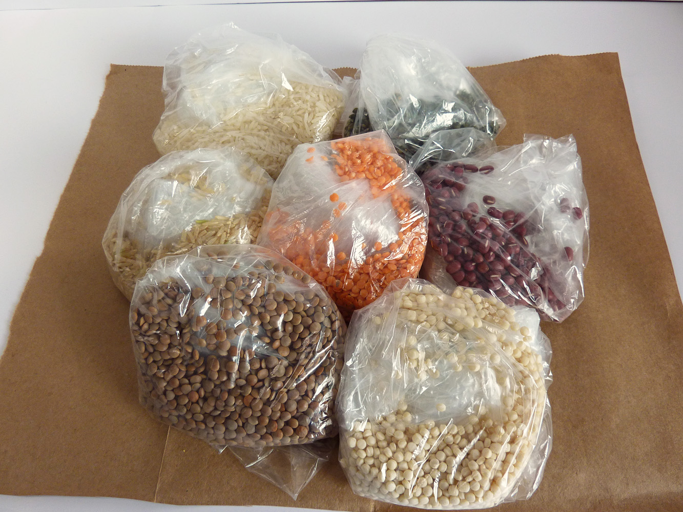
All of this for a grand total of $2.61 – including the paper bag became…
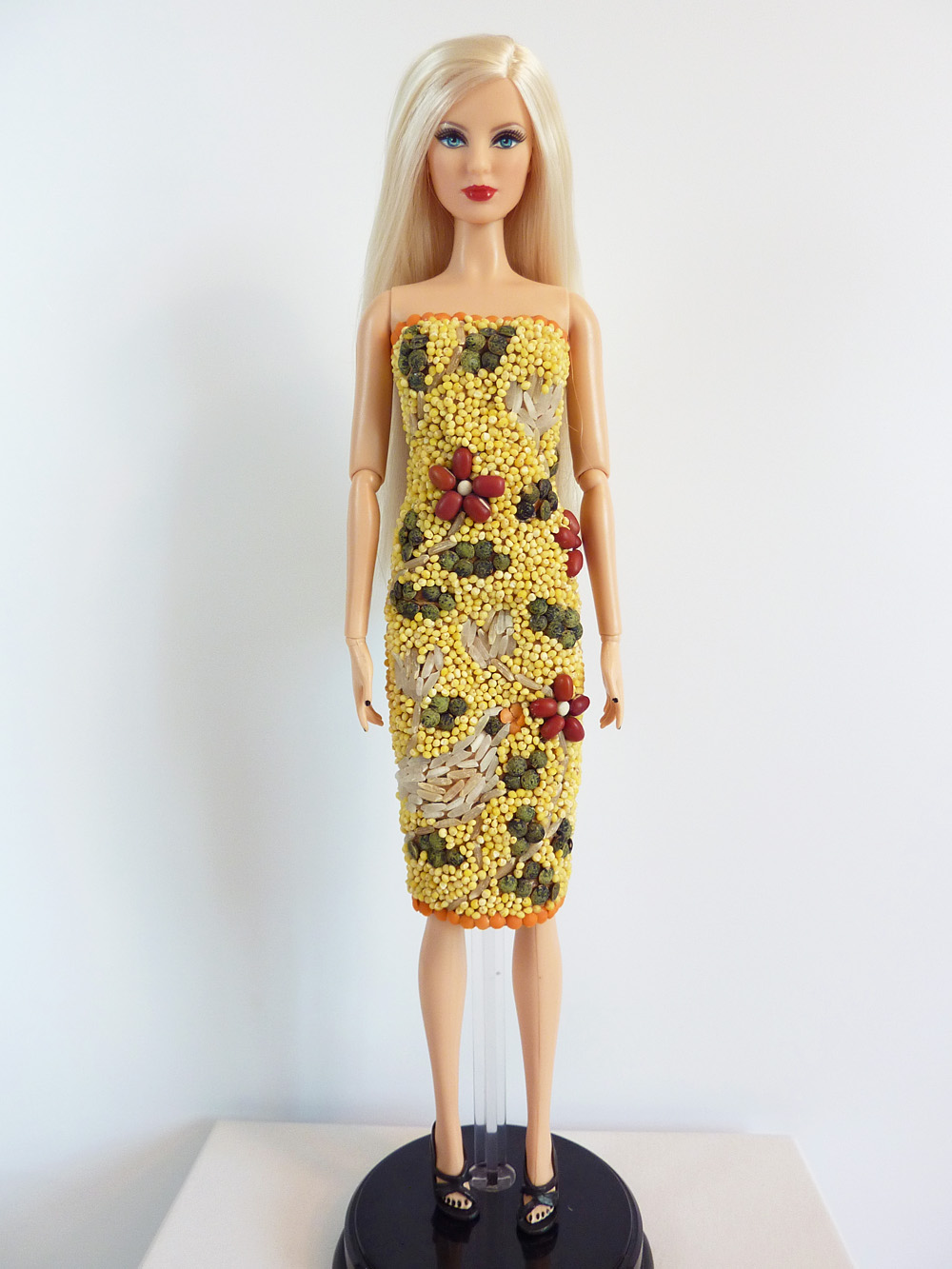
This! (Zhanna heads down the runway in a strapless, knee-length dress encrusted in grains, beans, and seeds.)
I determined that to really engage with the challenge, the base for my dress would also need to be an unconventional material. Using fabric and then applying the foods would be cheating. So I created the base for the dress out of the paper bag using a technique I learned in elementary school to make it softer and more malleable (crumpling it up and smoothing it out repeatedly.) I then sketched out my general design and began the tedious task of placing my designs. It’s supposed to be a bird (lower left hand side) and vines, leaves, and flowers.
As I had planned, the bird is made out of grains of white and brown rice, as are the white flowers and the stems/vines. The red flowers are adzuki beans with Middle Eastern couscous centers. The leaves are French lentils, the orange accents at the hem and top are red lentils. The overall “background” texture is millet. It’s all held in place by lots of glue.
Creating this look was quite time-consuming, but also in some ways relaxing. For the design elements, every grain or lentil was hand-placed with tweezers (the millet background notwithstanding.) The millet still took some time, but was not a grain-by-grain process. I painted on my glue and then sprinkled the millet over it, pressing it down and shaking off the excess. Needless to say there are a variety of small foodstuffs that I’m sure I will be discovering over the next few weeks throughout my craft room.
In styling this look, I didn’t want to take away from the bright natural colors of this look, while still being luxurious and “red-carpet ready.”
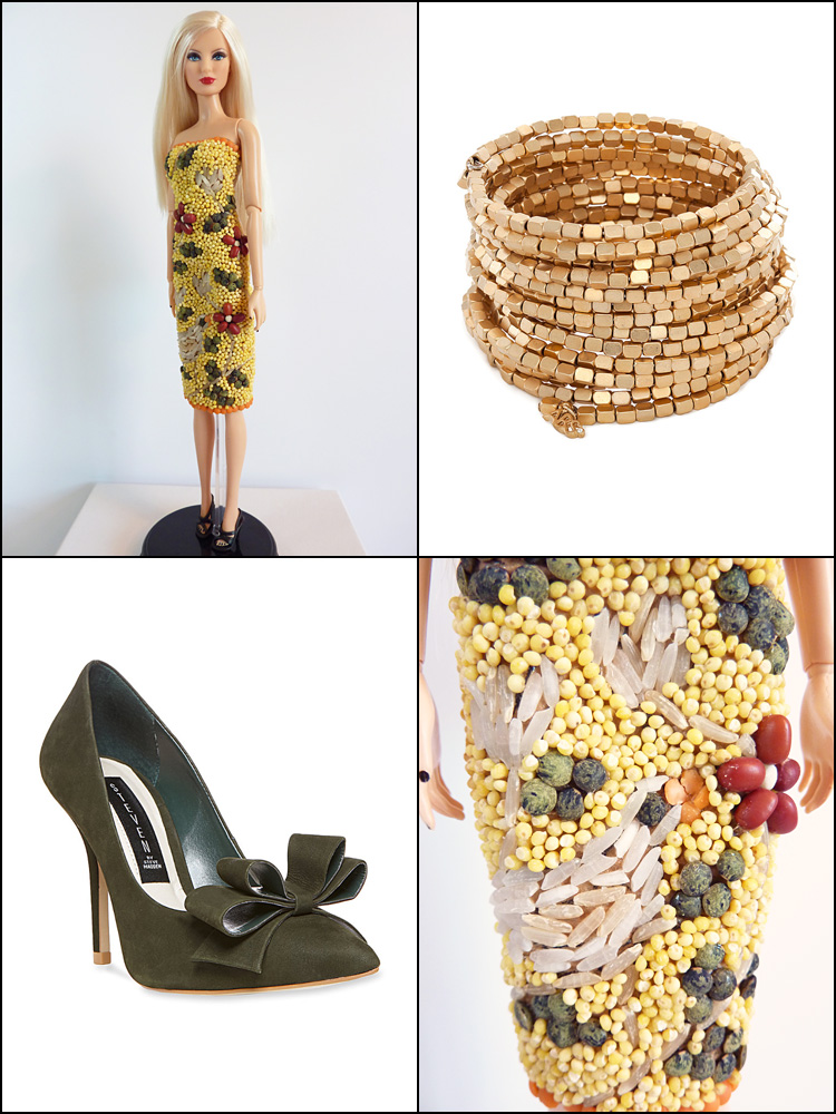
From the Belk wall I chose the ABS by Allen Schwartz Gold Tone Coil Bracelet because I thought the beading reflected the texture of the dress quite nicely. I also added a pair of Steven Ravesh Pumps in Olive Nubuck which matched the green French lentil “leaves” quite nicely. I also highlighted a close-up of the bird portion of the dress.
In terms of hair and makeup, I think the hair would be lovely loose, in softly curled waves. The makeup should use slightly more neutral autumnal tones than I usually utilize to create cohesion. Maybe coppery eye shadow and a medium-dark lipstick, deep in color but with a more orange-y undertone would work.
In general, I’m very happy with how this look turned out. It’s not exactly as I envisioned it, but it’s pretty darn close. I’m thrilled that the materials actually stuck to the dress base, I was envisioning seeds and lentils rolling down the runway, but it’s held up very well so far (Thanks, Tacky Glue!) I think it’s okay that I only used materials from one shop, as I could have gotten the paper bag or a similar material from the other stores, I was just being time- and cost-conscious in only utilizing one shop. I think I might be at the top this episode, but I’m not sure – it’s hard to tell with these judges. I mean, the bottom three were criticized for using placemats; the top three were lauded for using placemats. Would I be congratulated for using the unconventional materials in the way I did, or would I be criticized for using them as an application on the garment? Who knows. Well, I’m happy with it, so there.
And as always, check out the PPR Flickr Page for more great designs.

I think it is lovely! The color palette is really striking. I think the judges would be impressed with how you used the materials to create a textile. (BTW I’m pretty sure we have ANOTHER unconventional challenge this week, sigh)