Tag Archives: Season 12

PPR Season 12: Challenge 3

Posted on

This week’s challenge is called “An Unconventional Coney Island.” We were to design an outfit using items that can be won at a carnival. Furthermore, our outfits should be inspired by three words that can describe frozen yogurt (ugh.)

Well, let’s set aside the word association part of the challenge for a moment; there was no way I was going to go to a carnival and actually play rigged carnival games in a desperate bid to get materials. So I decided to go to basically the same source as carnival prizes: the dollar store. The dollar store actually ended up being a pretty great place to find carnival-like materials–they still had a lot of summer stock. I didn’t go in with a particular idea in mind, so I went a little bit crazy choosing materials. Hey, it’s all just a dollar, so it’s not like I was breaking the bank!

Items

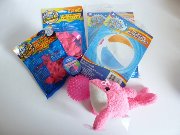
I picked up: two packages of water balloons, two beach balls, a spiky play ball, and a plush dolphin. I was most inspired by the balloons, and pink was the best color option, so I decided to stick to a monochromatic pink palette.

I was really inspired by the water balloons. They are a lot smaller than regular balloons and seemed to be a great scale for my model. I envisioned a petal skirt made of rows of the balloons. I just wasn’t sure what to pair the skirt with, so I bought enough stuff to have options.

Oh, and back to the frozen yogurt “inspiration words” I decided my words would be “summery,” “refreshing,” and “fun” (I know most people wouldn’t describe frozen yogurt as “fun” but did you see some of the descriptors people used on the show? “Happy?” “Divine?” “Luxurious?” Yeah.)

Main

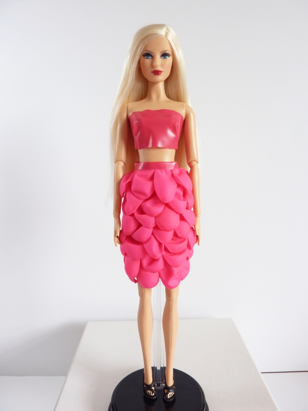
Zhanna heads down the runway in a bright pink petal skirt and a matching pink crop top.

The crop top and skirt base are made of the pink section of the beach ball. The skirt treatment is the water balloons. These materials were quite difficult to work with. The beach ball material has a tendency to stretch and deform as it’s worked with and the water balloons were absolutely coated in some sort of powder which made it difficult to affix them to anything. But hey, that’s what an unconventional materials challenge is all about, right?

I knew that the skirt would be rather eye-catching, so I wanted the outfit to be otherwise quite simple. I’ve done a dress with a similar skirt treatment before (last season’s unconventional material challenge – candy.) So I wanted to mix up the silhouette just a little bit, so I decided to do a skirt and crop top. Very few people could effectively pull off this look, but I do think that even though the top is strapless as well as cropped, it doesn’t quite cross the line to vulgarity due to the high waist of the skirt.

In the styling, I wanted to speak to the “summery” part of my descriptor words.

Style

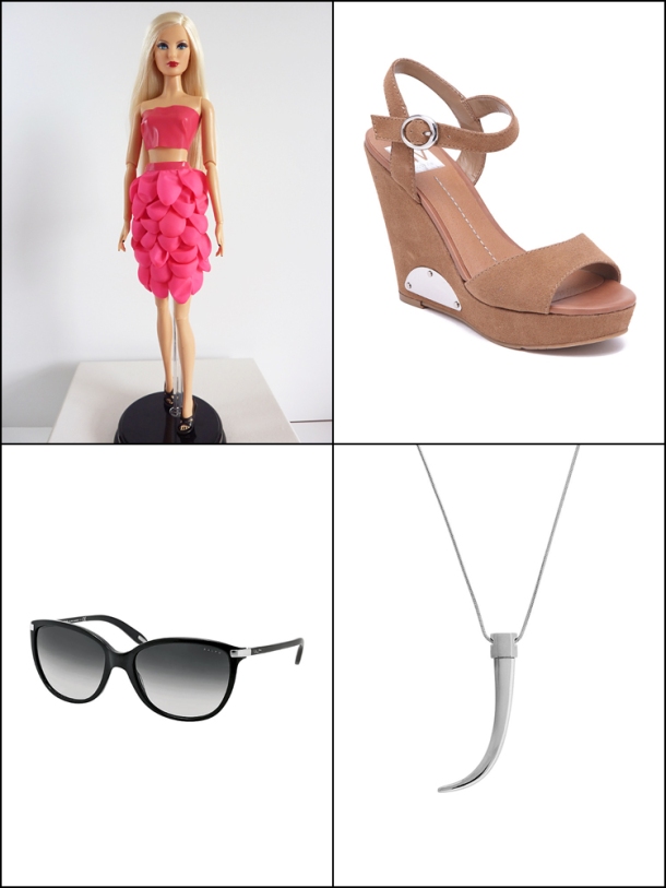
Once again, choosing from the Belk Wall was a bit difficult. Sorry to be so negative, but I really am not impressed with the accessory wall this season. For shoes, I chose a neutral platform sandal, the Dolce Vita Paylan Wedge Sandal. I also added a pair of Ralph by Ralph Lauren Plastic Cat Eye Sunglasses and a Vince Camuto By the Horns Silver Pendant Necklace.

I think the styling of this look indicates the wearer would be a fashion loving girl who isn’t afraid to be daring. I see this look as being extreme street wear – not really a red carpet look.

In terms of hair, I think something edgy would be cool. I’m thinking an undercut style, though I don’t know how amenable a model would be to such a drastic look. For makeup, I imagine going with a super neutral, pale lips and a bold extra-smoky eyeshadow.

In general, I like this look. It might not be something I would ever wear in a million years, but I think it is interesting. I like how the petal skirt looks, and I’m proud of myself for moving a little out of my comfort zone. I think I would be in the middle this week because the petals don’t lay perfectly and there are some minor fit issues with the top.

As always, don’t forget to check out the PPR Flickr page for other fantastic designs!
PPR Season 12 – Challenge 2

Posted on

The challenge this week for Project Project Runway is called “Million Dollar Runway.” We were to choose diamond jewelry from anywhere on the internet and design a look to go with those jewels. Goodness, was that ever tough! There are so many gorgeous jewels online, I didn’t really know where to start! Recommended sites included Tiffany & Co., Blue Nile, and Van Cleef & Arpels. Let’s just say there was much admiration going on. Still, I wasn’t finding what I was looking for, so I started looking elsewhere. My searches took me to Sotheby’s and Christie’s as I love vintage jewelry, and they get the best of the best. Let’s just say, oh, half a day was dedicated to drooling over amazing jewels. I eventually landed at Fred Leighton and just knew I had found just “the thing.”

jewels


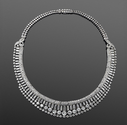
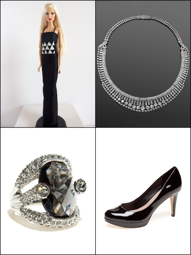
It’s a circa 1920’s Art Deco diamond necklace. So beautiful.

Once I found “the necklace” I almost immediately had my inspiration – the Zigzag Modern sub-type of Art Deco aesthetics. (Could I be more pretentious?)

I knew I wanted to design a gown, although gowns definitely are not my strong point; I see myself as more of a sportswear designer. But with what else would one wear such an extravagant necklace?  With the gown being a given, I wanted it to feel statuesque, like Art Deco skyscrapers that would show off the jewels rather than overpower them. My inclination was towards a black dress, but that seemed too simple. So I settled on a black and white scheme. I also wanted it to have strong visual, graphic interest. As the Rose Iron Works website describes it, Zigzag Modern, “features repetitive, geometric designs, both figurative and abstract, with zigzags and angular patterns.” So I definitely wanted to include some aspects of that. I’m crazy, but I had a vision of equilateral triangles.

Main


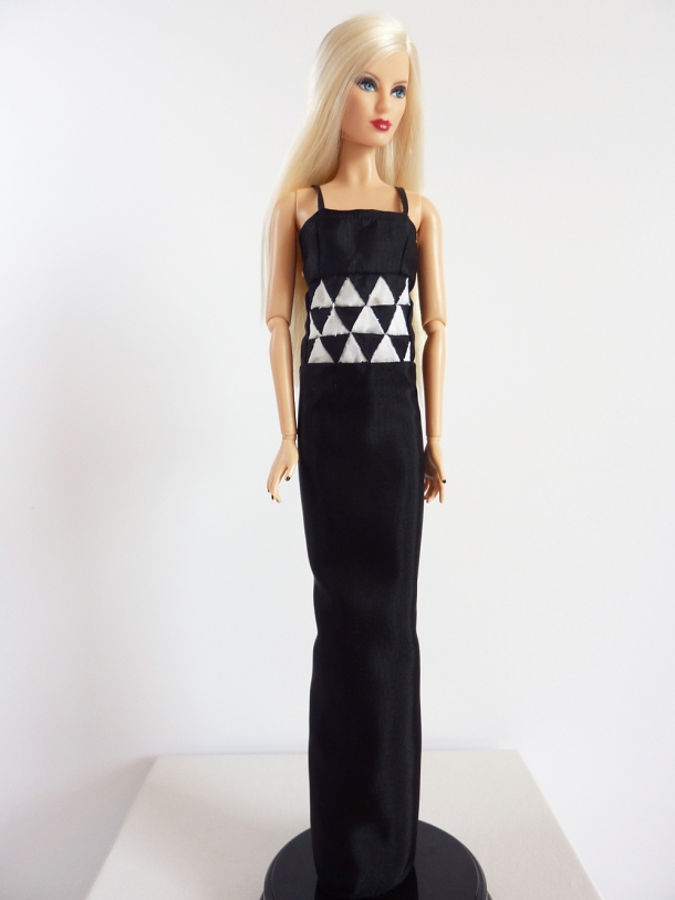
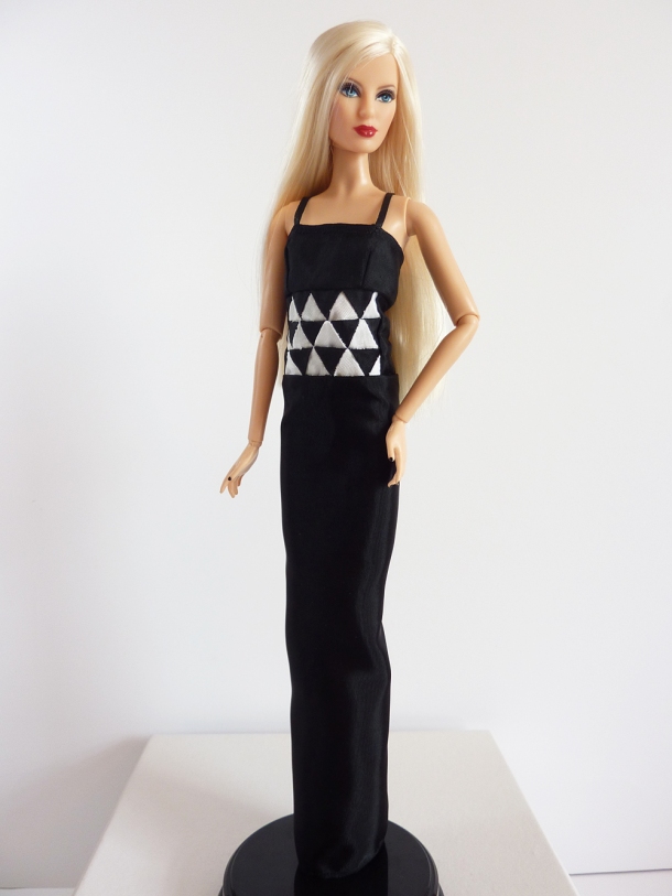
Zhanna walks the runway in a black column dress featuring a black and white triangle treatment at the waist.

Yes, triangles it was. And what a challenge (but in a good way.) The fabric I chose was a thin but crisp taffeta (“party taffeta”?) The triangles are .5″ from apex to base. I used a template for the triangles, drawing them on the fabric with marking pencils. I then Fray-Checked around the triangles and then cut around them with an eyeballed seam allowance. Next, I sat in front of DVRed episodes of Inspector Lewis for a few hours and sewed the triangles together by hand (and I am not a hand sewist!) I then made the upper bodice piece and skirt, and then hand stitched those on as well to ensure decent triangle points. The skirt and upper bodice are very simple to allow the waist treatment and the jewels to do the heavy lifting.

In styling, I wanted to keep things super simple. With an eye-catching diamond necklace and a graphic dress, I didn’t think it needed much else.

Challenge 2 Style


So from the Belk Accessory Wall I added the black Vince Camuto Zella Pumps and the ABS by Allen Schwartz Large Stone Set Pave Ring. I’m not sure about the ring, but I thought it might be a fun “high-low” juxtaposition with the real diamond necklace.

In terms of hair and makeup, I think vintage style would be great for the makeup. I’m thinking a touch of smoky gray eyeshadow, black lashes and dark plum red lipstick in a “Cupid’s Bow” style would hearken to the era of Art Deco without being super literal. For hair, I think a slicked back ponytail would be lovely.

over shoulder

Overall, I am ridiculously proud of this look as it is almost exactly what I had imagined. I was really, really unsure if I could pull off the triangles. I seriously spent two or three days thinking about how I could do it before I even bought my fabric. That’s one luxury the real Project Runway contestants don’t have, that’s for sure. I think this is one of the coolest looks I’ve ever made for Project Project Runway. It’s just so satisfying to see the seed of an idea come to fruition. It’s certainly not perfect (my hand stitching skills need some serious work and the seams ended up bulkier than I had hoped) but it is certainly one of the most ambitious looks I’ve attempted. This week I’d like to think I’d be near the top. Maybe not the challenge winner, but perhaps beginning to be noticed by the judges.

Don’t forget to check out the other designers’ looks at the Project Project Runway Flickr page. See you on the Runway!

PPR Season 12 – Challenge 1

Posted on

After I dropped out of Project Project Runway Season 10, I wasn’t sure I would ever do PPR again. I just felt so bad abandoning the project last year, never resuming it after the move was completed. I felt like I had given up and couldn’t do it again. So imagine my surprise when I saw the announcement for PPR Season 12 and instead of dread I felt – excitement?! With PPR not following Season 11, it’s been a full calendar year since the beginning of the last PPR season, so I’ve had time to “recharge my batteries” as it were.

The tl:dr version: I’m back for more PPR.

This week’s challenge is called “Sky’s the Limit.” We were to create a look that represents our points of view as designers using parachute fabric (or the closest stand-in we could find.) We had 19 hours to complete the look (which I will say now, I didn’t use anywhere close to the allotted time.) As far as I know, we didn’t have a budget for this challenge, as the designers were provided with their materials. (Speaking of budgets, I think the season’s giving the designers a lump sum budget to use as they desire is brilliant. Is PPR going to follow this style of budgeting as well?)

As we were not provided materials (what do you mean a parachutist didn’t drop in so that I could accurately recreate the show’s challenge?!) I knew I needed to find a reasonable facsimile of parachute fabric. The closest thing I could think of was rip stop nylon, so I began designing my garment with that fabric’s feel in mind. I wanted to design something that would utilize the fabric’s intrinsic body and drape (or lack thereof.) So I started thinking about how I could use the stiff “plastic-ness” of the fabric to create interesting shapes. I then had a connection in my head: parachutes are in the sky, balloons are in the sky. A balloon dress. For me, the most iconic balloon dress (partially because it was the first time I saw such a thing) is the original 1959 Barbie outfit Gay Parisienne. And how perfect since a Barbie doll is my PPR “model”? So I decided to make an modern homage to that dress.

Full 2

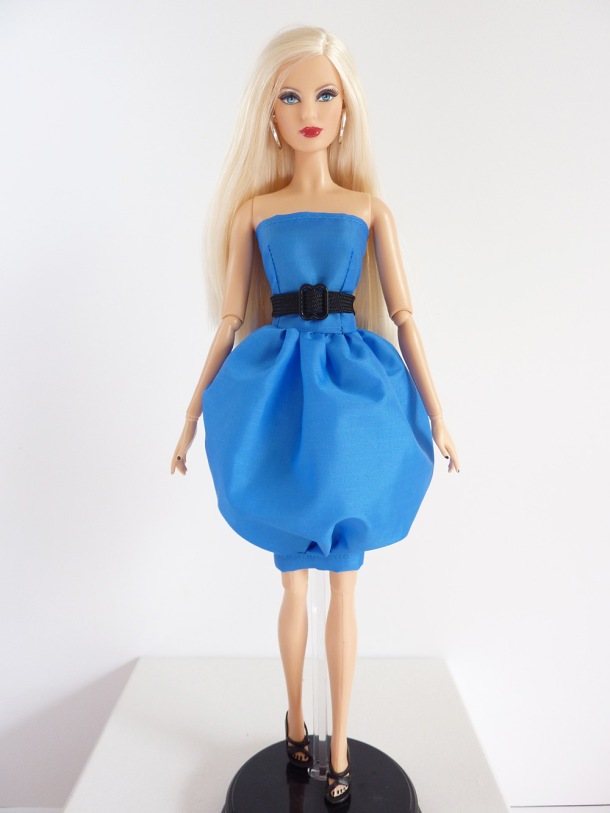
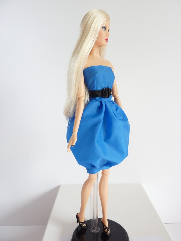
Zhanna heads down the runway in a bright blue balloon dress.

This dress had a couple of iterations before this one. I struggled in getting the proportions right and the skirt to sit just the way I wanted. My initial design had a way more complicated bodice, for which I spent a lot of time drafting the pattern. Once I had the pattern drafted, though, I knew it was way beyond my abilities to actually create. So that was scrapped. My second iteration had to go into the trash because it was too short-waisted and the proportion was all wrong. And furthermore I discovered that pins created unsightly holes in the fabric, so aside from anything that would be hidden inside the dress, I couldn’t use them. So this is the third iteration of this dress. It features a simple, slightly dropped-waist bodice with a full gathered balloon skirt. The skirt terminates just above the knee, and would be very difficult to maneuver in if it were for a real person and not a static mannequin. The look is completed with a woven “parachute ripcord” belt with a buckle. (Fun fact, the buckle is a bra strap adjuster. They are the perfect size for faux buckles. Just FIY.)

In styling the look, I wanted fairly neutral items so the exaggerated skirt wouldn’t be competing for attention. The balloon skirt is clownish enough, over-the-top accessories would make the look a disaster!

Style

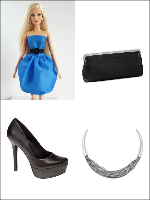
From the Belk wall I chose, from top right, the “Hobo Deanna Clutch” in black. I like the simple lines of this clutch. I then picked the “Vince Camuto Summer Metals Silver Multi Strand Necklace” because the strands felt similar to the woven straps of a parachute. Finally, I chose the “Jessica Simpson Waleo Pump” in black leather. Who says blue and black can’t look nice together? I’m not sure how much of this season I will use the Belk wall, as I don’t think most of the items fit my style very well. Or I will just end up reusing the same items over and over. Oh well.

In terms of hair, I think a sleek, slightly bouffant ponytail would accent the look nicely. For makeup, a bluish-gray smoky eye with a defined black lash line would be pretty and would highlight the way the dress compliments Zhanna’s eyes. Fresh pinky cheeks and medium pink lips would help complete the look.

Full Side

Overall, I think the look is okay. There are a lot of construction errors on the dress that are driving me crazy, but I just have to deal. I think the dress does speak to its vintage inspiration while updating it to modern times. I’m happy that the rip stop nylon did hold its shape the way I wanted. It was pretty hard to work with, so I’m glad that at least that aspect of my idea came to fruition. Does it represent me as a designer? I think it does in the way I like to play with shapes and my love of color. I think I would be safe this week. Not at the top, for sure, but I think I may have managed to stay out of the bottom (at least this dress keeps her lady parts covered, unlike some of the real contestants’ garments.)

And remember, the other designers’ looks can be seen on the PPR Flickr page. Check it out, there are always wonderfully talented people there!